Sidney Scones Rebrand
Client
Sidney Scones
Industry
Food & Beverage
Location
Sidney, BC
Completed
May 2026
Project Details
Brand strategy
Visual identity
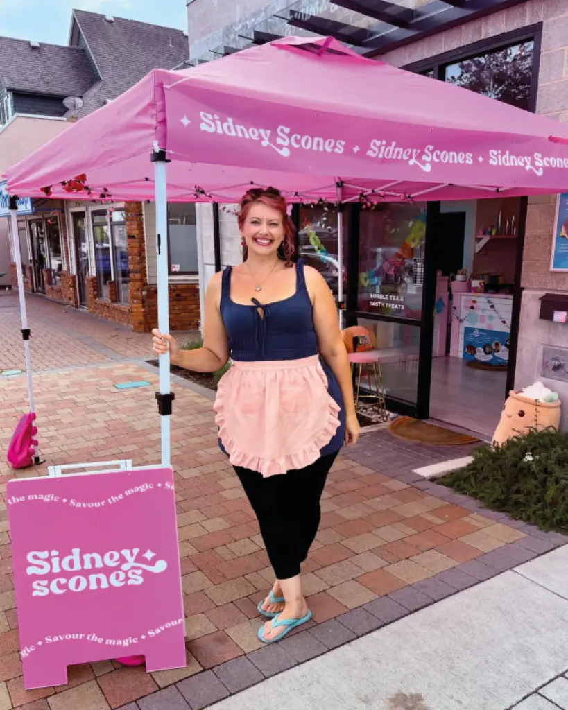
Signage
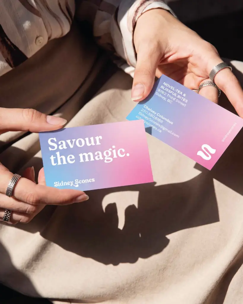
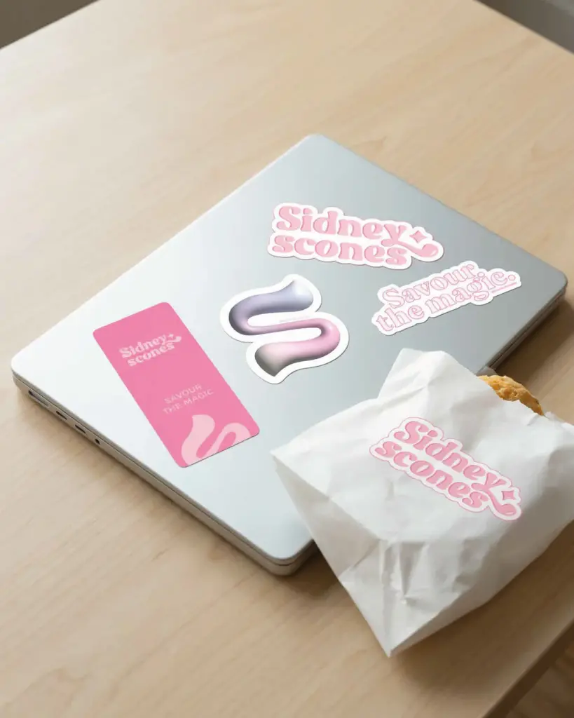
Print collateral
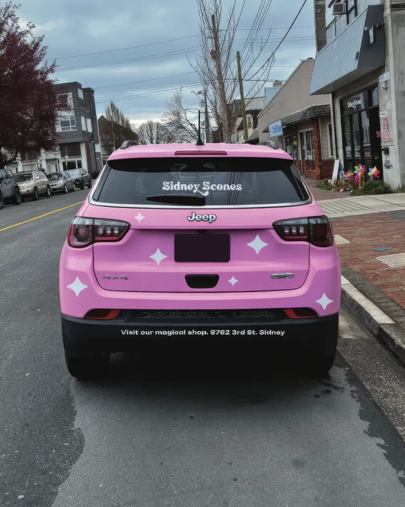
Vehicle graphics
Website
Hosting
Overview
Chelsey’s scones had a following on the Saanich Peninsula long before the shop. They drew lines at markets and sold out every preorder. When she opened on Third Street in Sidney, those people came with her.
We first talked about menu boards, then saw the real gap. The scones had built the brand, and the look hadn’t caught up. That’s common with small shops where the product leads.
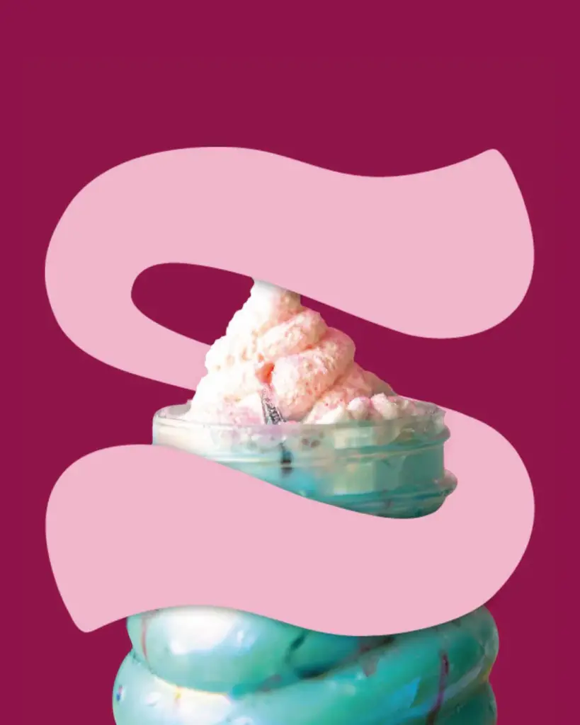
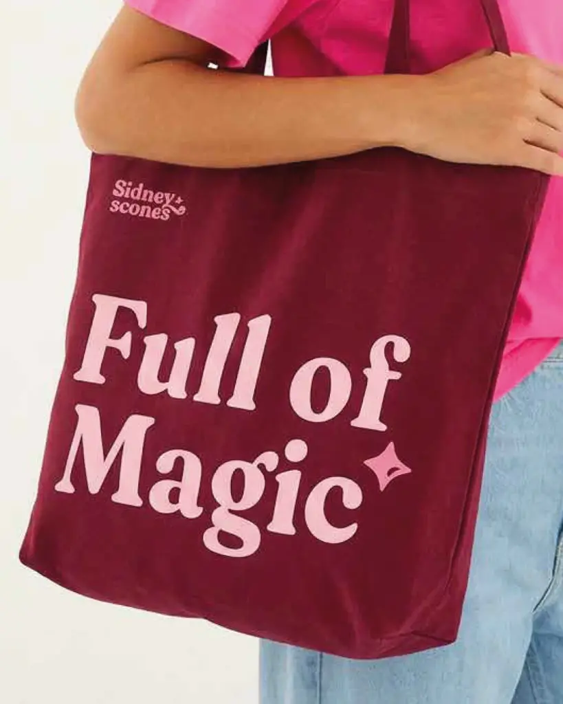
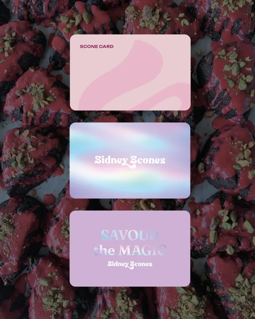
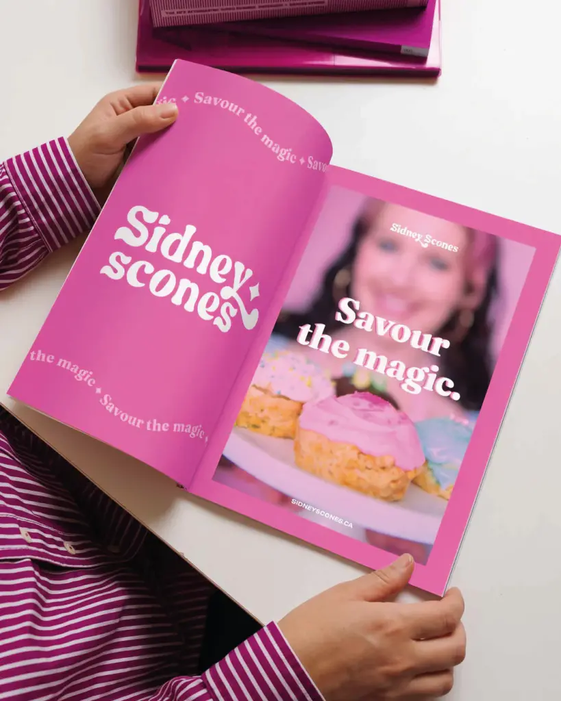
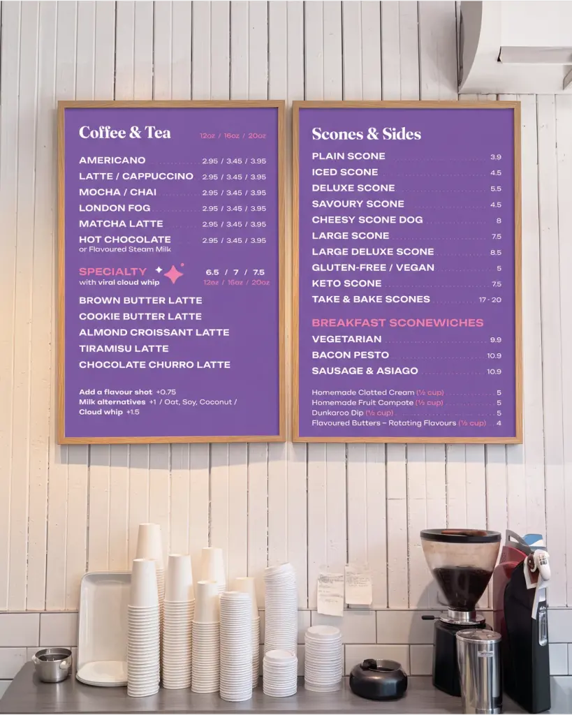
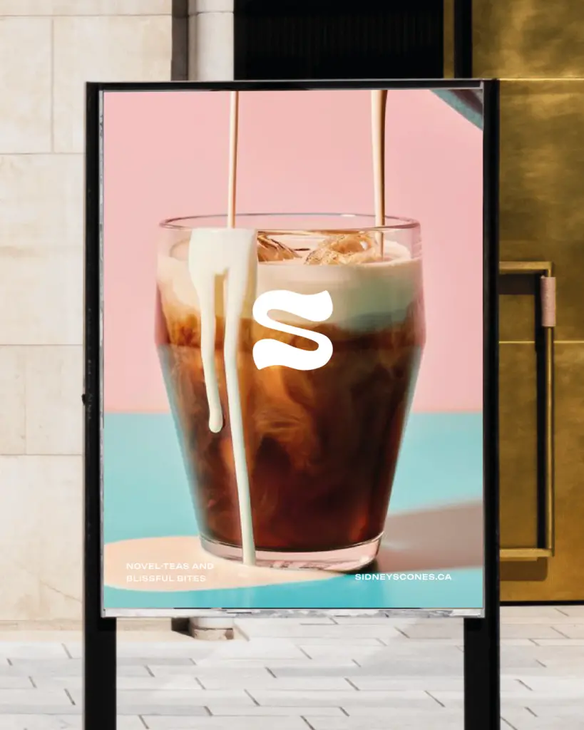
So we worked with Chelsey through Dig Deep, our strategy and brand identity process paired with weekly traction and coaching. Week by week we found her position and her line, “Savour the magic.”, and built an identity around it. A gooey S icon came from icing glazing a warm scone. We added a retro wordmark, a twinkling star, and a palette of Raspberry, Cherry and Cotton Candy. It went onto menu boards, window decals, gift cards and her pink Jeep, and we simplified her website and now host it.
A couple of years in, the shop has grown, and the scones still set the direction.