Blackrete Builders
Project Details: Visual strategy, Tagline development, Creative direction, Brand book, Signage, Collateral, Fleet graphics, Website updates, Gear design
Overview
Blackrete Builders has made their name in vertical construction and concrete formwork on Vancouver Island. Their reputation was earned, and as the company grew, the brand needed room to grow with it.
Blackrete had become a construction management company, with pre-construction, general contracting and more sitting alongside the concrete work they were known for. The old identity still pointed at where they started. They needed a brand identity that could reposition them for who they are today: a full construction partner, clear across every touchpoint on a job.
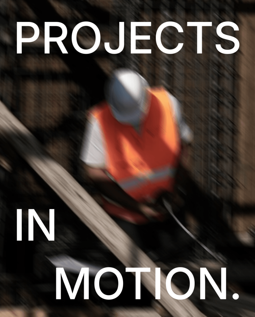
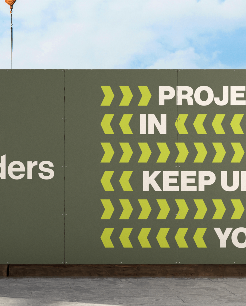
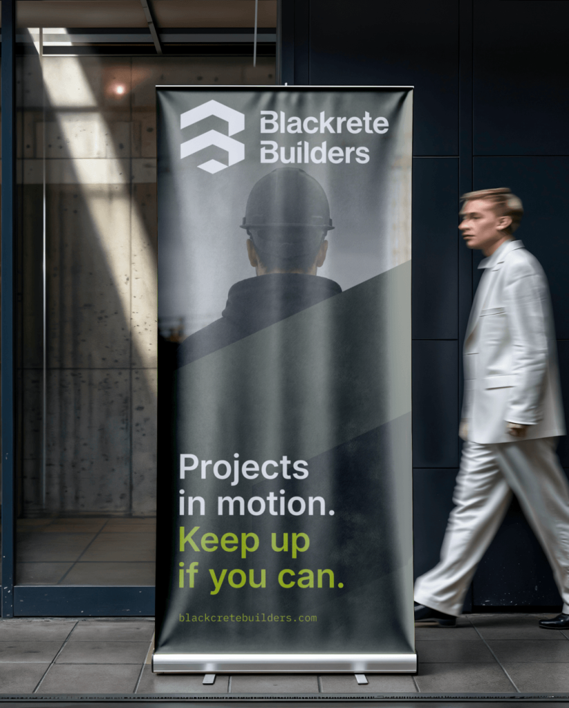
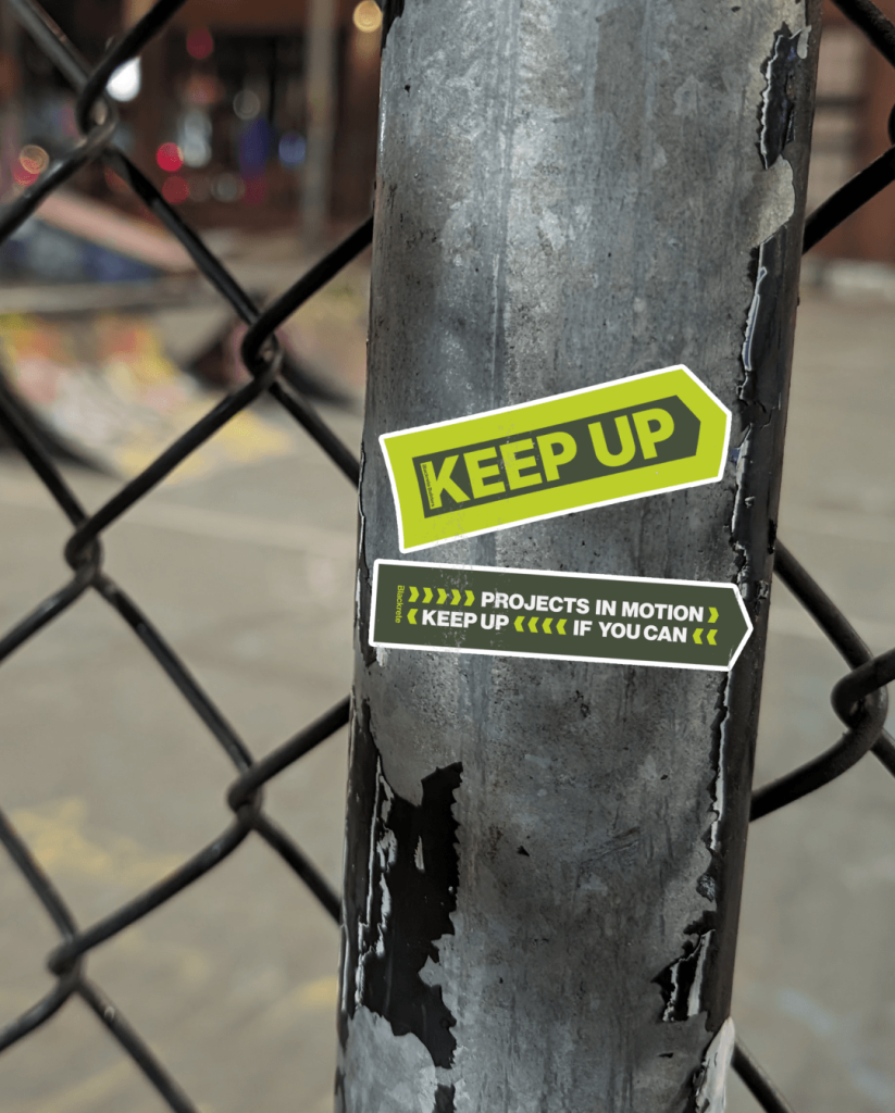
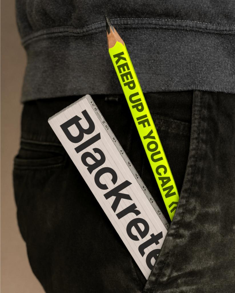
When we were brainstorming with the team, we wanted to avoid the overused terms of “building and constructing” for tagline and positioning lines. One theme emerged: Forward motion. The line that locked it was simple and sharp. Projects in motion. Keep up if you can.
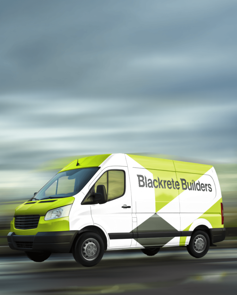
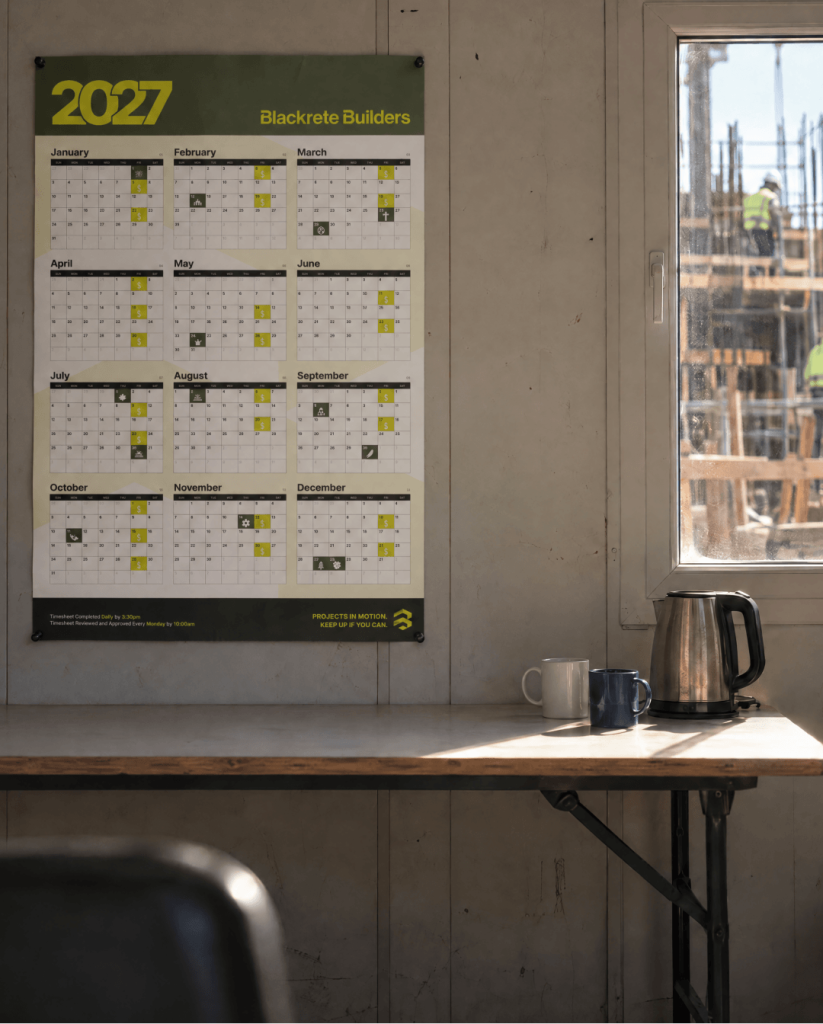
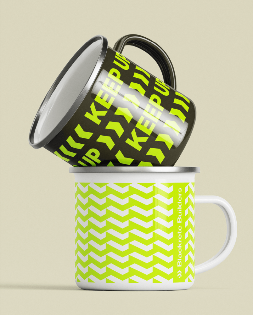
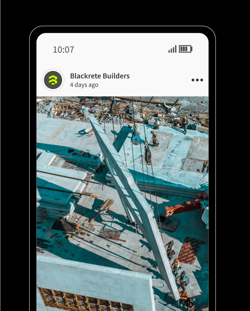
From there we built the Blackrete brand identity around bold type, high-vis colour, strong geometry and photography of real work happening. Iron Black, Utility Green and High Vis Yellow carry the system.
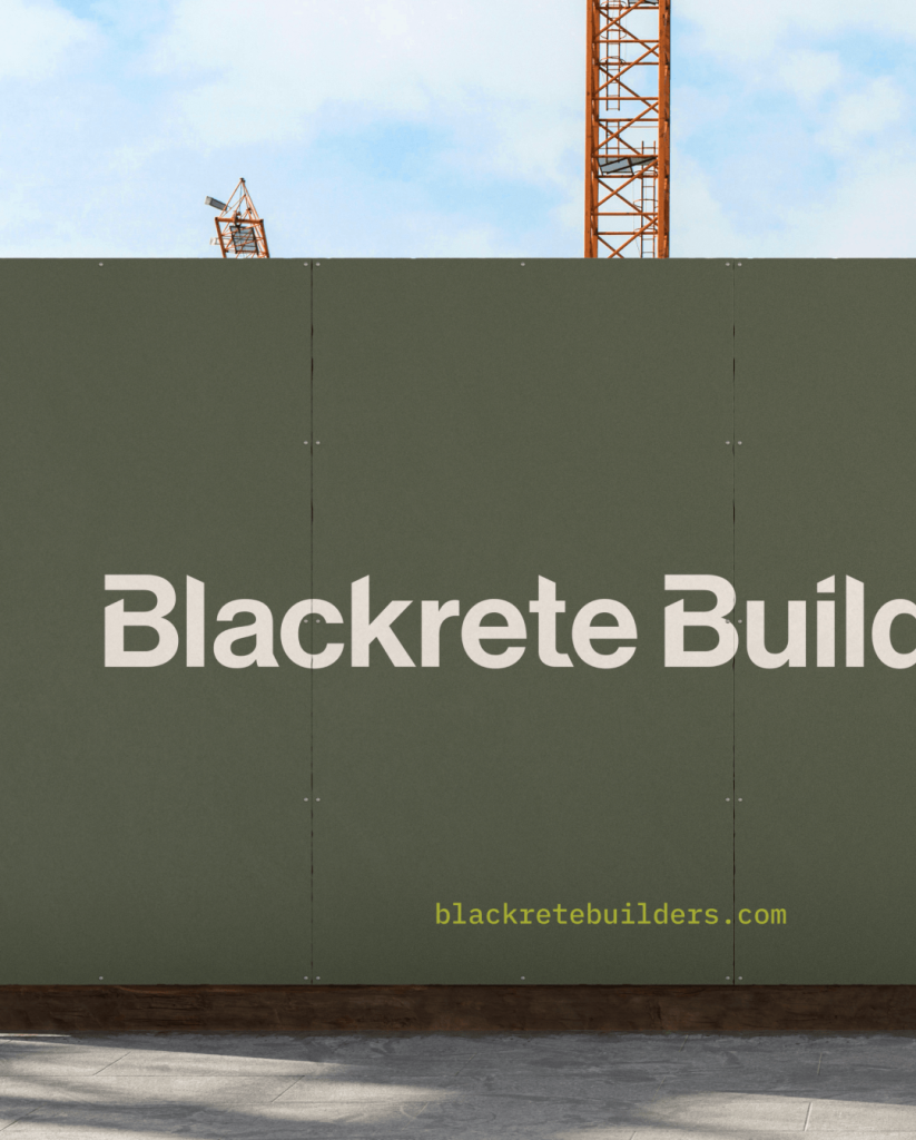
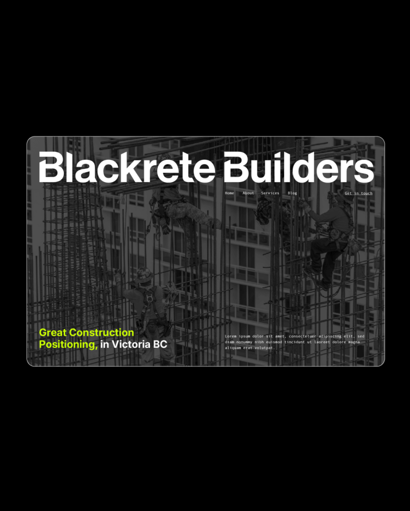
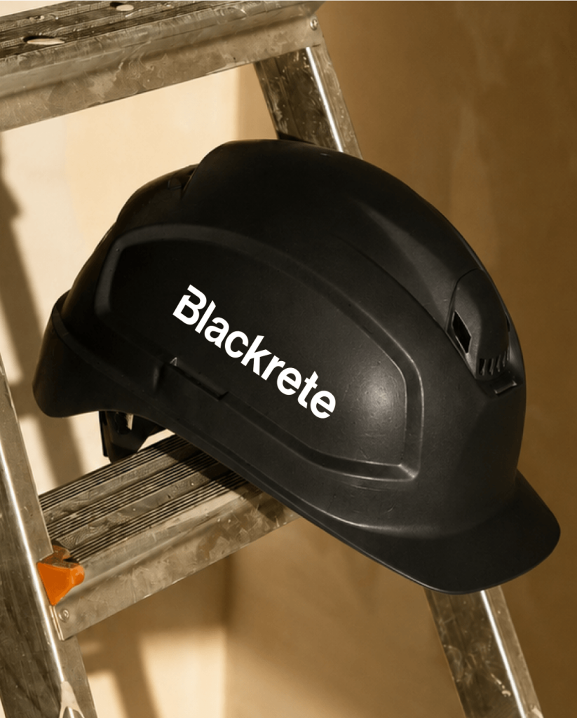
The refresh rolled out across the touchpoints that matter on a job: fleet graphics, construction fence mesh, site signage, stationery, business cards, team gear, plus website updates so blackretebuilders.com matched the new look.
The result is a brand built for who Blackrete is now. Clear on sites, harder to miss, and moving with a distinct voice everywhere they show up.